8. The Retirement Income Chart#
8.1 Chart Overview#
The Retirement Income Chart is the central view of the application. It gives you a year-by-year projection of your income — or a client’s income — from the current age through to the expected end of life.
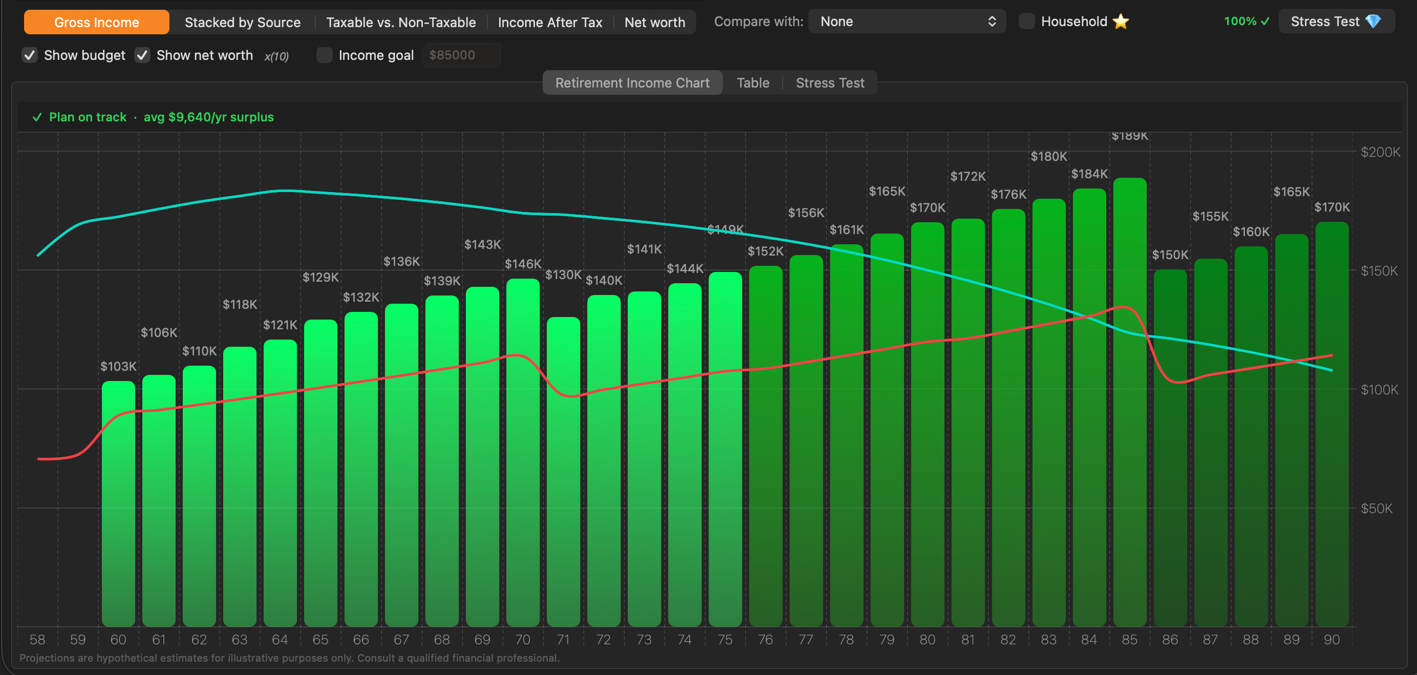
How to read the chart:
- The horizontal axis (x-axis) represents age, advancing one year at a time from the plan start age to the maximum lifespan configured in the strategy settings.
- The vertical axis (y-axis) represents annual dollar amounts. Depending on the active chart type, this may be gross income, taxable income, after-tax income, or net worth.
- Each vertical bar represents one year. Its height shows the projected total for that age.
- A scrollable canvas lets you pan through the full projection timeline when many years are shown. Pinch or use your trackpad to scroll horizontally.
Hovering over the chart shows a tooltip after a brief delay. For simple bar charts, the tooltip displays the age and the dollar amount for that year. In Stacked by Source mode, the tooltip also identifies which income component the cursor is over.
Plan on track banner: When a budget is set and the Budget line is enabled, a banner appears at the top of the chart area:
- Green checkmark — net income meets or exceeds the budget in all projected years. The banner also shows the average annual surplus (e.g., avg $9,040/yr surplus).
- Orange warning — net income falls below the budget in one or more years, indicating a shortfall.
Additional options: Show budget - When selected, displays a projected annual budget as a red line chart. Show net worth - When selected, displays calculated net worth as an azure line chart. The net worth line is scaled to fit, and the scaling factor is displayed beside the ‘Show net worth’ checkbox (×10 in the image above). Income goal - When selected and set, displays an inflation-adjusted income goal as an orange dotted line chart.
Other options (Compare, Household, and the Stress Test) will be explained in more detail in later sections.
Tip: The chart reflects all the parameters entered in the strategy tabs (CPP start age, RRSP drawdown, pension details, etc.). Any time you change a strategy setting, the chart recalculates automatically.
8.2 Chart Types#
A five-segment control in the toolbar lets you switch between five different views of the same projection data. Each answers a different planning question. The active segment is highlighted in orange.

8.2.1 Gross Income#
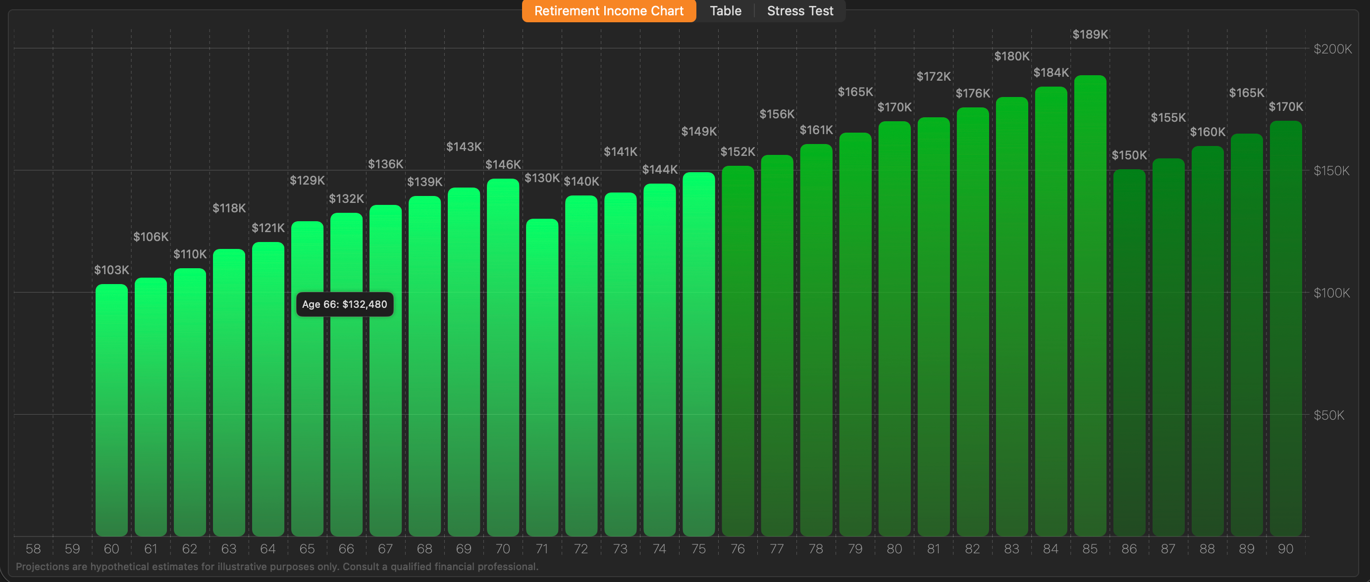
Gross Income shows your total projected annual income from all sources combined, before any taxes are applied. Each bar represents one year.
Bar appearance: Bars are rendered in a green gradient — lighter at the base, darker at the top — giving each bar a sense of depth. Dollar labels are printed above (or offset from) each bar so you can read exact amounts without hovering.
Hover tooltip: Move your cursor over any bar and, after a brief pause, a tooltip appears showing the age and the exact gross income amount for that year (e.g., Age 66: $132,480).
Best used for: Getting a high-level read on the overall income trajectory — whether income rises, peaks, and declines, and roughly when significant changes occur (e.g., CPP starting at 65, OAS at 70, RRSP depleting).
Go-Go / Slow-Go / No-Go shading: In this mode, the bar shade shifts across the retirement phases you defined in the Budget tab. Early years in the “Go-Go” phase are the brightest green; bars transition to slightly darker shades in Slow-Go and No-Go years.
8.2.2 Stacked by Source#
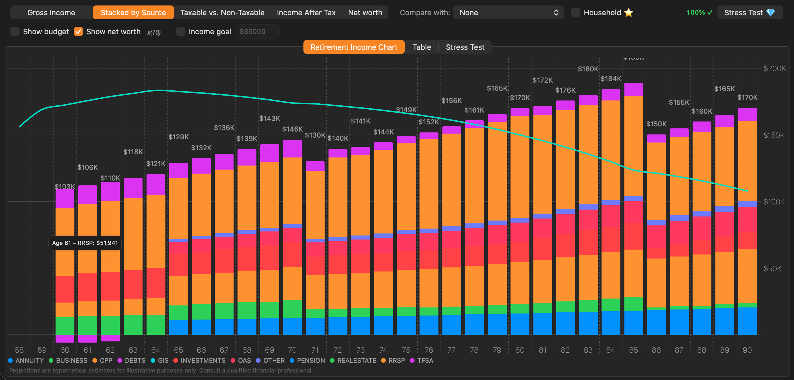
Stacked by Source breaks each annual income bar into coloured bands, one per income source. The height of each band shows exactly how much that source contributes in that year. Debt repayments will be displayed as negative amount bars.
Colour legend: A legend at the bottom of the chart identifies each source by colour. Sources visible in the legend are only those present in the strategy — sources with zero income for all years are omitted.
Hover tooltip: Hovering over a specific band within a bar identifies which income source the cursor is over, along with its dollar amount for that year and income source.
Best used for: Understanding the composition of retirement income year by year — for example, seeing RRSP withdrawals dominate the early years while CPP and OAS phase in, then watching RRSP deplete as TFSA takes over.
In Household mode: Primary and spouse income each appear as their own named bands within every bar, so combined household income is still broken down by source and by person.
8.2.3 Taxable vs. Non-Taxable#
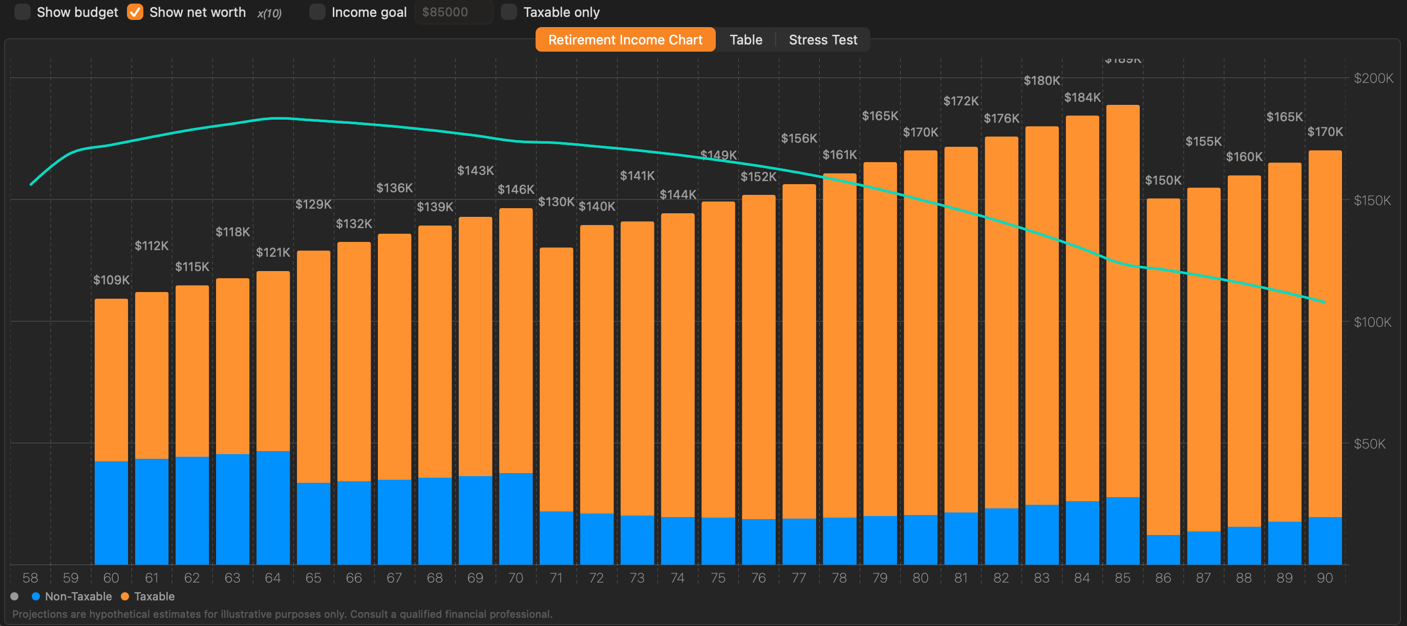
Taxable vs. Non-Taxable splits each annual income bar into two portions:
- Blue (bottom) — income that is not subject to income tax (e.g., TFSA withdrawals, return of capital)
- Orange (top) — income that is taxable (e.g., CPP, OAS, RRSP/RRIF withdrawals, pension income, business income)
Taxable only toggle: The toolbar shows an additional Taxable only checkbox in this mode. When enabled, the non-taxable (blue) portion is hidden and only the taxable income is shown, making it easier to focus on the tax-exposed component of income.
Best used for: Evaluating how tax-efficient a drawdown strategy is. A high orange-to-blue ratio means more income is exposed to tax; shifting withdrawals toward TFSA in a given year would convert orange to blue and potentially reduce the tax bill.
8.2.4 Income After Tax#
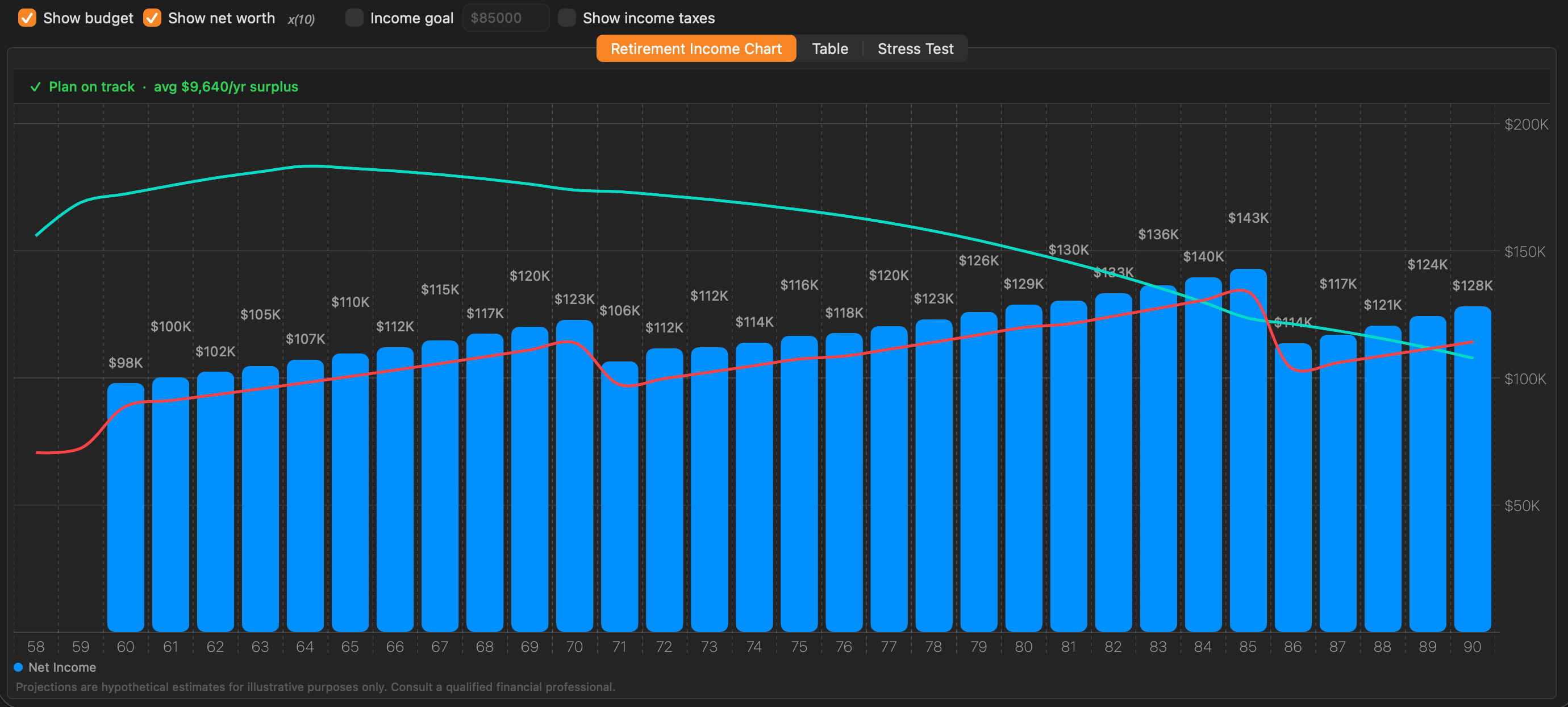
Income After Tax shows the net income remaining each year after estimated federal and provincial income taxes have been deducted. This is the most direct measure of actual spending power.
Bar appearance: Bars appear in solid blue and are labelled “Net Income” in the chart legend.
Show income taxes toggle: An additional Show income taxes checkbox appears in the toolbar for this mode. When enabled, the estimated tax amount for each year is displayed.
Best used for: The most realistic view of what a retiree will actually have to spend after CRA takes its share. Compare this against the budget to determine whether the plan is viable.
8.2.5 Net Worth#
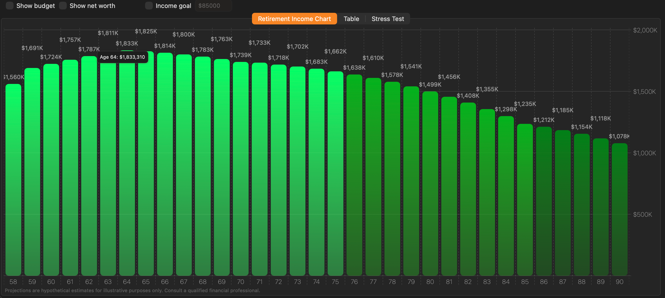
Net Worth replaces the income bars with a view of total projected asset value at each age — the combined balance of all asset accounts after accounting for that year’s withdrawals, contributions, and growth.
What is included in net worth: RRSP/RRIF balance, TFSA balance, non-registered investment accounts, and real estate equity (property value minus outstanding mortgage).
Bar appearance: Like the Gross Income mode, bars are rendered in a green gradient with dollar labels above each bar.
Reading the chart: Because this view shows total wealth rather than annual income, a gently declining line over time is completely normal and expected in retirement — assets are being consumed to fund living expenses. The important question is whether net worth reaches zero before the end of the projected lifespan. If it does, the plan needs adjustment.
Net worth overlay vs. Net Worth chart type: The Show net worth checkbox in the toolbar adds a net worth line on top of the income bars in other chart modes. The Net Worth chart type replaces the income bars with net worth bars entirely. The overlay is hidden automatically when you switch to this chart type to avoid redundancy. The budget chart line will be hidden in this view as well.
Best used for: Assessing portfolio longevity. If the bars remain positive all the way to the maximum age, the plan has a positive legacy. If they approach zero or turn negative, the strategy needs revision.
8.3 Budget Line#
The budget line lets you plot a spending target directly on the income chart so you can instantly see whether projected income is sufficient to meet it in every year of retirement.

Setting a budget: Enter an annual spending target in the Budget tab of the strategy editor. You can set a base amount and optionally configure it to adjust for inflation each year.
Showing the budget line: Enable the Show budget checkbox in the chart toolbar. The budget line appears as a smooth red curve running across the bars.
Plan success indicator: When the budget line is enabled, a status banner appears above the chart:
- Green — Projected income meets or exceeds the budget in all years. The plan is on track.
- Orange — Projected income falls short of the budget in one or more years. A shortfall exists.
In the Table view: When the budget is enabled, two extra columns appear — Budget (the target amount for that year) and Bgt Diff (the difference between projected income and the budget, positive meaning a surplus). These columns make it easy to identify exactly which years have a shortfall and by how much.
Tip: The budget line works well alongside the Income After Tax chart type. This lets you compare net spending power against your after-tax income target, which is generally the more meaningful comparison for retirement planning.
8.4 Net Worth Overlay#
The Net Worth overlay adds a secondary line to the income chart showing your projected total asset value at each age, without switching away from your income view.

Enabling the overlay: Check the Show net worth checkbox in the chart toolbar. A teal (mint-coloured) line appears over the bars.
What net worth includes: The overlay accumulates the balance of all asset accounts at each age — RRSP/RRIF, TFSA, non-registered investments, and real estate equity — after accounting for withdrawals, contributions, and growth assumptions for that year.
Automatic scaling: Net worth is often a much larger number than annual income. To keep both visible on the same chart without compressing the income bars, the app automatically scales the net worth line. If the line is scaled, a label such as ×2 or ×3 appears near the net worth legend. Multiply the right-axis values by that factor to get actual net worth dollars.
Reading the chart: A declining net worth line is expected and normal — assets are being drawn down in retirement. The key planning question is whether the line reaches zero before the end of the projection. If it does, the plan may need adjustment (lower spending, later CPP start, TFSA optimization, etc.).
Note: The net worth overlay is hidden automatically when you switch to the Net Worth chart type, since that view already shows net worth as the primary bars.
8.5 Comparing Two Strategies#
The comparison feature overlays a second strategy’s projections on top of the current one.
Requires Pro or Advisor. Choosing a strategy from the Compare with: dropdown on the Personal plan opens the upgrade paywall. A saved comparison is also not restored when you reopen a strategy on the Personal plan.
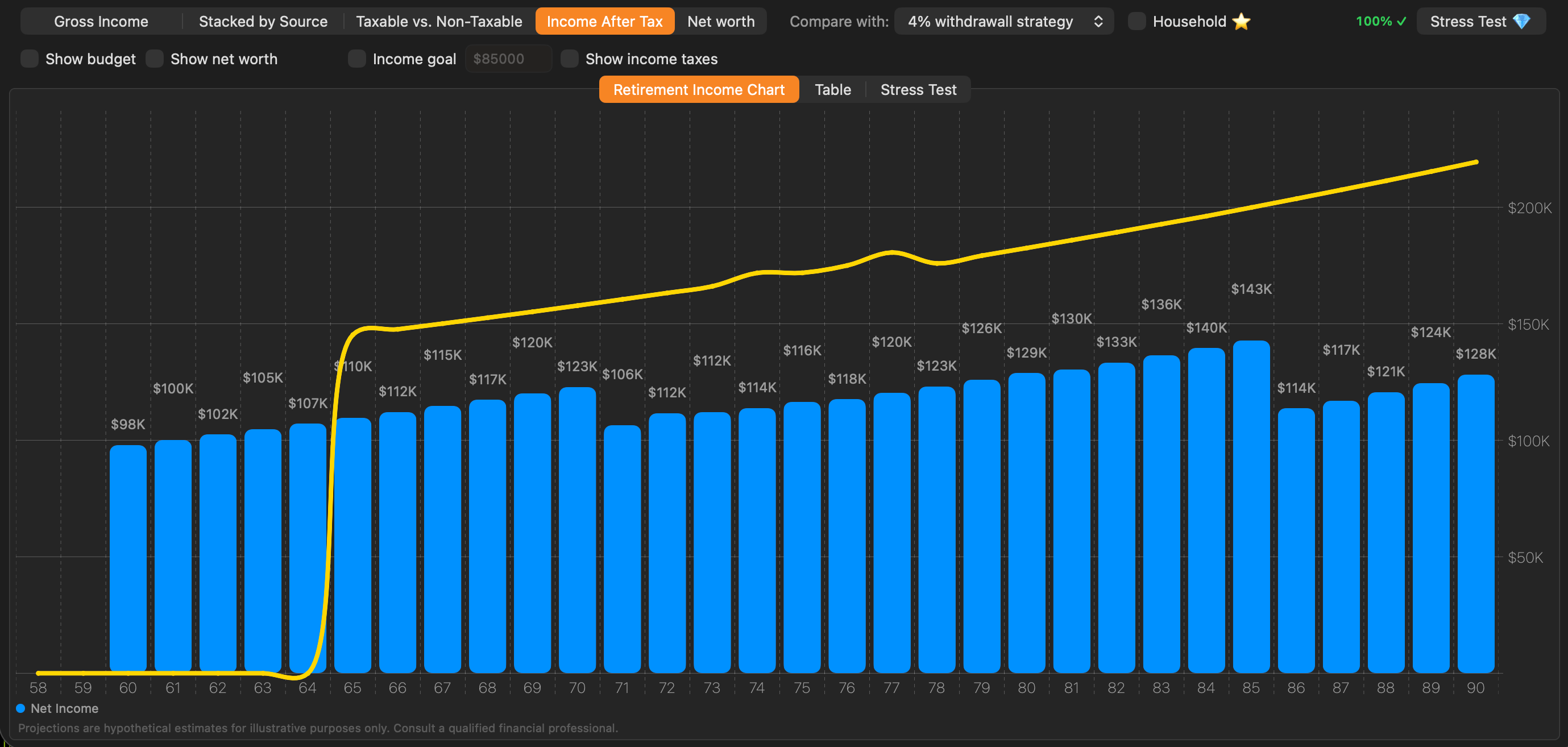
To compare strategies:
- Open a client who has at least two strategies.
- Make sure the desired primary strategy is selected in the strategy selector at the top.
- In the chart toolbar, locate the Compare with: dropdown.
- Select the strategy you want to compare against. The comparison line appears immediately in yellow.
Reading the comparison:
- The bars always represent the currently selected (primary) strategy.
- The yellow line traces the same income metric for the comparison strategy. If you are in Income After Tax mode, the line shows the comparison strategy’s after-tax income; in Net Worth mode, it shows its net worth trajectory.
- Above the yellow line means the primary strategy outperforms the comparison in that year; below means the comparison is stronger.
In the Table view: Switching to the table with a comparison active shows side-by-side columns for both strategies — Gross, Taxes, and Net Income for each — so you can read the exact dollar difference per year.
Note: Strategy comparison is not available while Household mode is enabled. Compare strategies on individual client plans first, then switch to household view to assess the combined picture.
8.6 Income Target Line#
In addition to the budget line, you can display an income target — a smoothly inflation-adjusted reference curve showing what a starting income amount grows to over time as purchasing power is maintained.
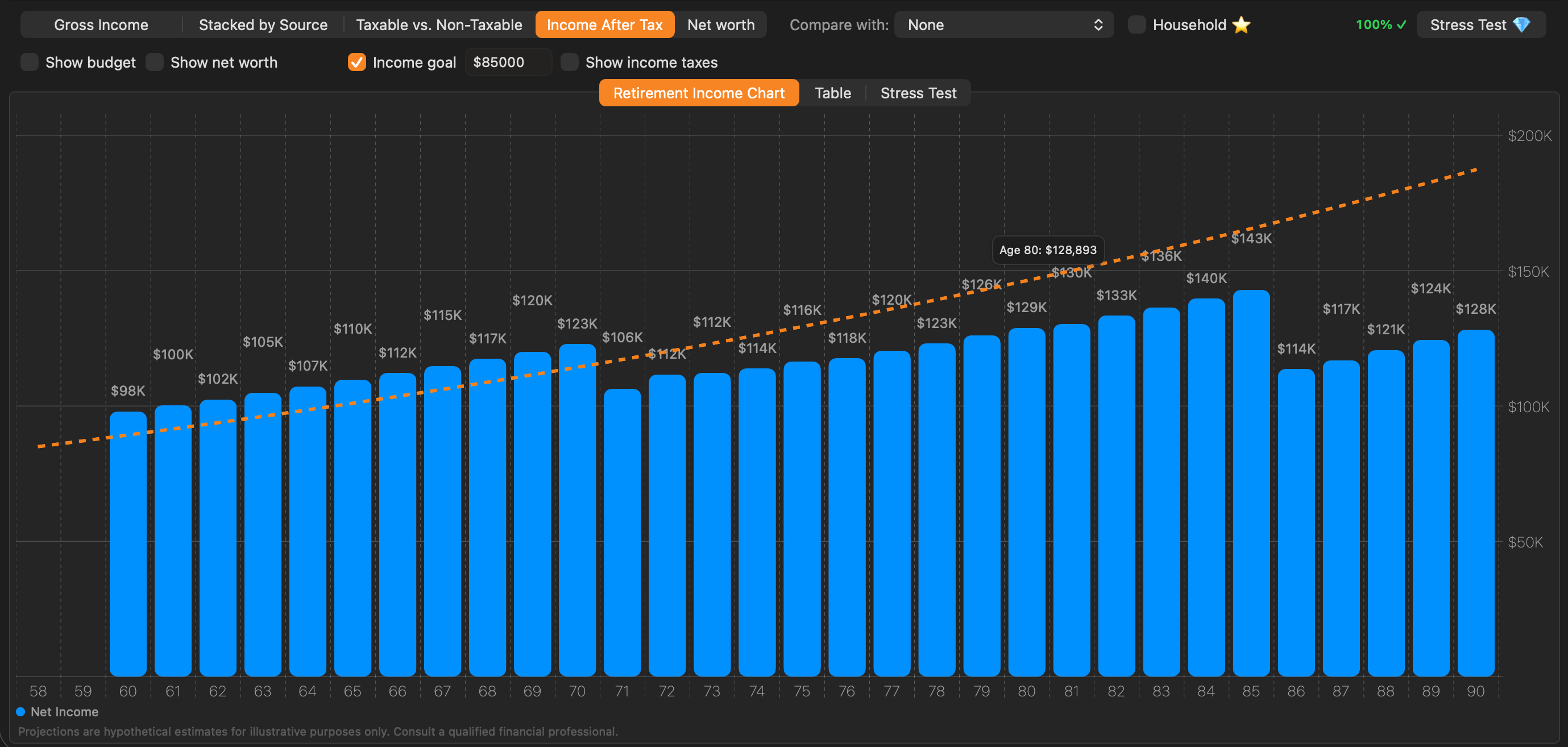
Setting the target: Enter a starting annual income target in the strategy settings. The app applies the inflation assumption from the strategy to project the target forward each year.
Reading the line: The income target appears as a dashed orange line on the chart. Unlike the budget line (which is a fixed or user-defined path), the target line rises gently each year in line with inflation, showing the real-dollar equivalent of your baseline income goal.
Tip: Use the income target alongside Income After Tax to check whether your after-tax income keeps pace with inflation throughout retirement — a common planning concern for long retirements.
8.7 The Table View#
The Table tab presents the same projection data as the chart in a row-by-row tabular format — one row per year of age. It is ideal when you need exact figures or want to export the data for further analysis.
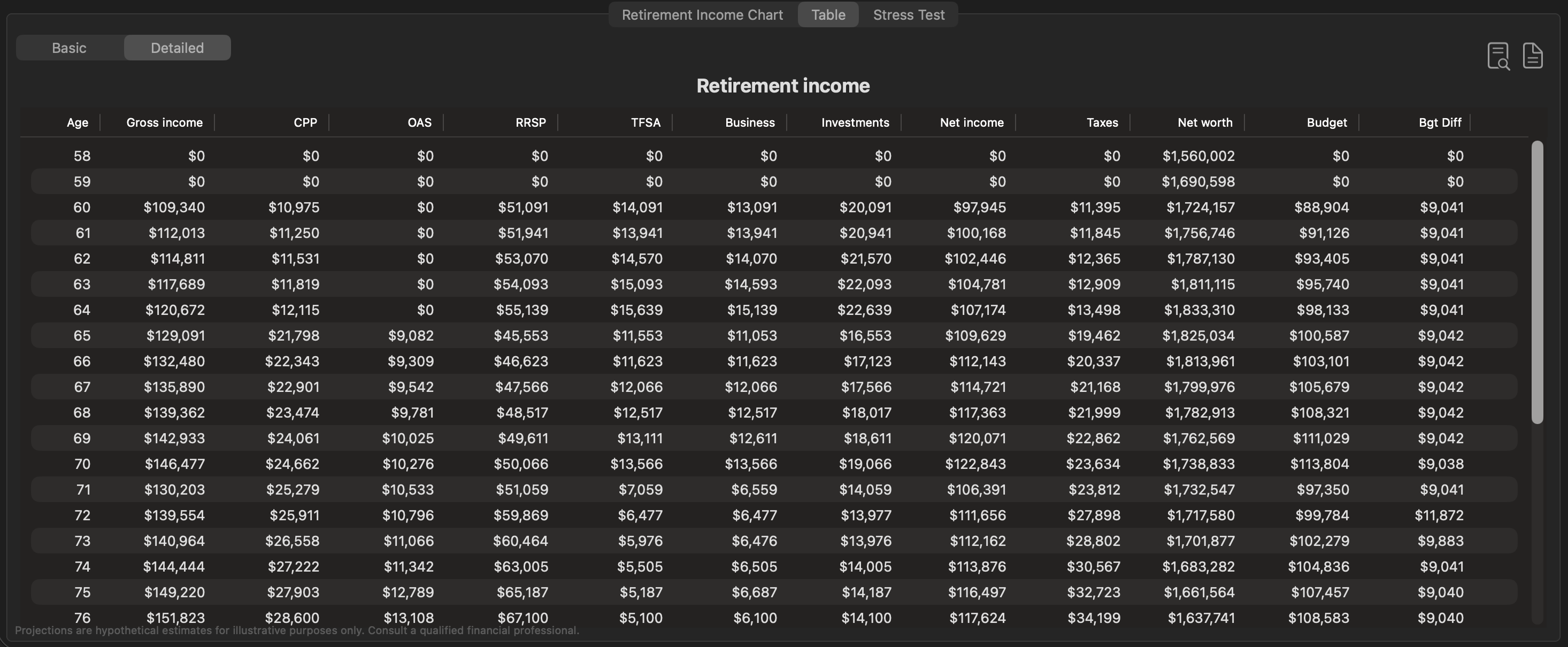
Switching to the Table view: Click the Table button in the view selector below the toolbar (between “Retirement Income Chart” and “Stress Test”).
Basic vs. Detailed mode#
A two-segment control at the top-left of the table switches between Basic and Detailed layouts.
Basic mode shows a concise summary with the most important columns:
| Column | Description |
|---|---|
| Age | The projected age for that year |
| Gross Income | Total income from all sources before tax |
| Net Income | Income remaining after estimated taxes |
| Taxes | Estimated federal + provincial tax for the year |
| Net Worth | Total projected asset value at end of year |
| Budget (if enabled) | The spending target for that year |
| Bgt Diff (if enabled) | Surplus (positive) or shortfall (negative) vs. the budget |
Detailed mode expands the table to show each income source in its own column, giving you a full breakdown of where income comes from in every year:
| Column | Description |
|---|---|
| Age | The projected age for that year |
| Gross Income | Total income before tax |
| CPP | Canada Pension Plan income |
| OAS | Old Age Security |
| RRSP | RRSP / RRIF withdrawals |
| TFSA | TFSA withdrawals |
| Business | Business income |
| Investments | Non-registered investment income |
| Net Income | Income after estimated tax |
| Taxes | Total tax for the year |
| Net Worth | Total asset value |
| Budget (if enabled) | Spending target |
| Bgt Diff (if enabled) | Surplus or shortfall vs. budget |
Only income sources that have a non-zero value in at least one year appear as columns. If there is no pension or real estate income in the plan, those columns are omitted.
Comparing strategies & the table view#
Strategy comparison in the table: When a comparison strategy is selected via the “Compare with:” dropdown, the Detailed table switches to a side-by-side layout showing Gross, Taxes, and Net Income columns for both the primary strategy and the comparison strategy, with the difference between them also shown. This makes it straightforward to see exactly which years one strategy outperforms the other, and by how much.
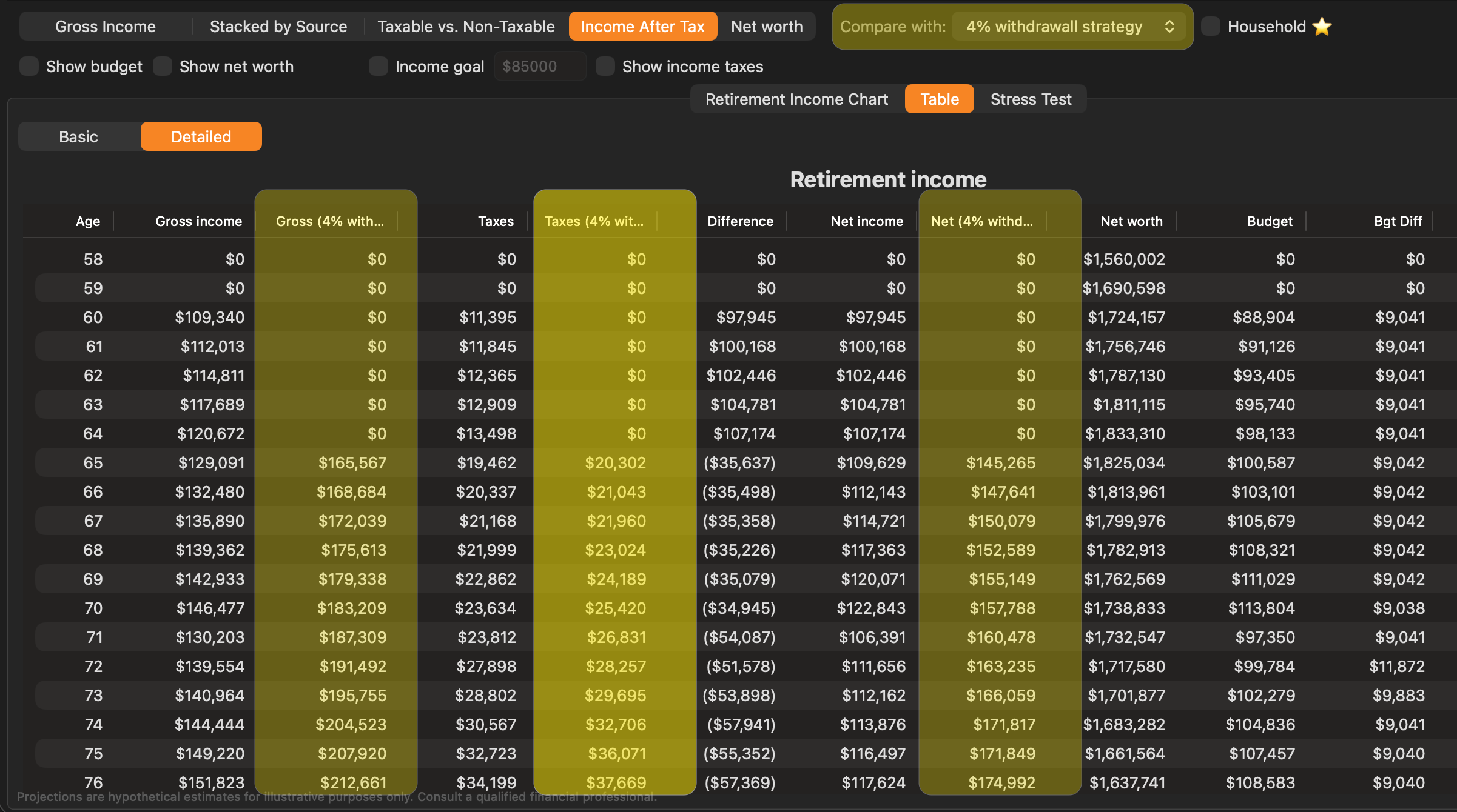
Exporting the table#
Right-click anywhere on the table for four export actions:
- Copy as CSV — copies the table to the clipboard as comma-separated values, ready to paste into Numbers, Excel, or Google Sheets.
- Copy as JSON — copies the table to the clipboard as JSON, for use in a script or data analysis tool.
- Save as CSV… — writes the table to a
.csvfile at a location you choose. - Save as JSON… — writes the table to a
.jsonfile at a location you choose.
Whichever mode the table is in — Basic or Detailed — the export contains exactly the columns currently displayed, so switch to Detailed first if you want the per-source breakdown.
An Export to PDF icon in the toolbar renders the table as a formatted PDF and prompts you for a save location.
 Blue Plum Software